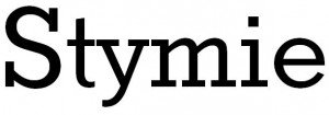
May’s font of the month (Calibri) is a relative newcomer but this month’s font, Stymie, has been around for decades.

Its ‘Extra Bold’ version was very popular in the 1950s and 60s; this was heavily used by the BBC and other broadcasters and found its way to many signs, building names and so on, particularly in an italicised form made from chunky letters.
I have seen the standard version in printed publications several times in the last few weeks (although it would be handy if I could actually remember what they were!). It’s probably not a font I would use for body text but would make an attractive font for headings and graphic design work.
PS, forgot to say – a very similiar but much more common cousin of Stymie is Rockwell. There are only slight differences between those two fonts.
Last updated on Wednesday 6 June 2012 by GaryReggae